Mobile foldable devices and their impact on UX and UI
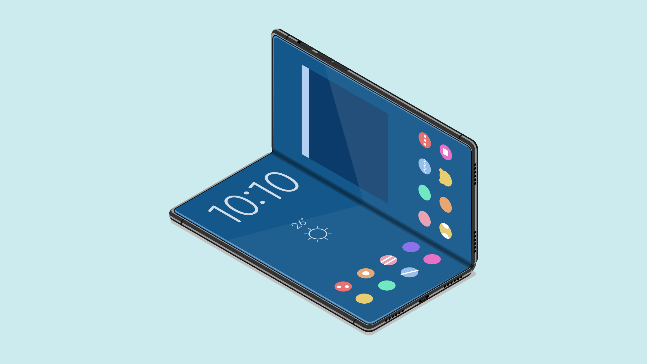
The popularity of foldable phones has been exponentially increasing since the release of the Samsung Galaxy Fold in September 2019. Uniting smartphone and tablet in one, these new types of phones continue to create a lot of excitement as there haven’t been any drastic innovations in the smartphone industry for a long time. Although they still haven’t quite entered the mainstream space yet (as some factors like battery performance and pricing still have to be improved), developers should start looking closer into how to design UX and UI for foldable phones, as they are some major changes compared to the design of “regular” phones.
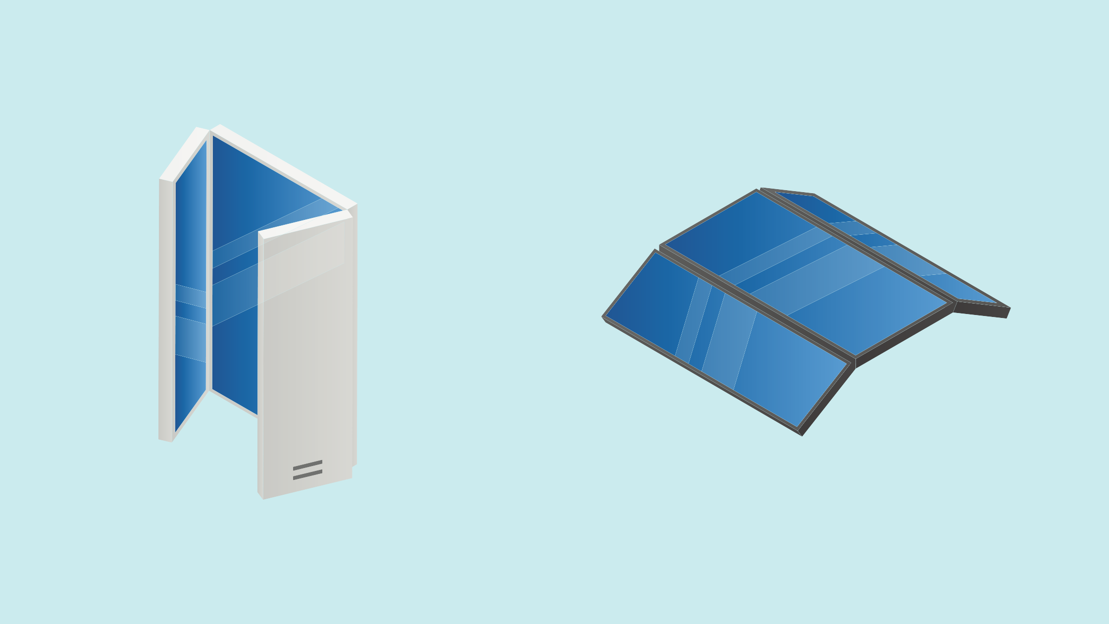
To better understand what the challenges in the UX/UI design are, let’s look first at what features and benefits make these phones so special. As the name reveals already, they can be folded which means there are two different form factors: when it’s folded, the cover screen is visible and the phone resembles a usual smartphone with the only difference that it’s thicker. When it’s unfolded, the screen gets a lot bigger, resembling a tablet. However, there are different types of foldable phones:
Flip phones (like the Samsung Galaxy Flip) which resemble the old clamshell flip phones dating back to the 90s. They have a small display on the outer clam which only shows notifications, date and time or other widgets. When you open it up, it pretty much looks like a regular smartphone.
The other types fold out on a vertical axis, with the bigger display either folding inward (for example Samsung Galaxy Fold) or outward (for example Huawei Mate X). While most foldable smartphones turn into one big screen in an unfolded state, there are also some with a dual screen (for example LG G8X ThinQ).
This flexibility and variety of screen sizes lead to the benefits of foldable phones:
The enhancement of productivity through multi-tasking: one of the main benefits of foldable phones is that they enable multi-tasking. Through the additional screen space the phone can enter a multi-window mode, so that several apps can be used at the same time, for example you can read a text while simultaneously making notes.
Entertainment: the additional screen space is great for entertainment purposes, like watching movies or playing games
Content creation: the bigger screen gives content creators more options for working on their content
However, at the same time these different screen sizes are causing the main challenges in the UX/UI design of apps for foldable phones. When designing an app, these are the things you should consider:
Screen and app continuity: the transition between different screens should be smooth and automatic, with only slight changes in the layout. Also, the app has to always resume in the same location and state after a change of screens. The different aspect ratios further complicate things, as they don’t only vary between screens but also between different phone brands. To solve this issue you can create a resizable app through dynamic resizing. This is done by using resizeableActivity=true. Furthermore, you will have to think about what information and features should be available on what screen. The additional space provided on the bigger screen can be used in many different ways.
Multi-window mode: as mentioned above, one of the main purposes of foldable phones is to facilitate multi-tasking through a multi-window mode. Consequently, when designing your app, keep in mind that your app might share the screen with other apps. Since Android 10 was released a multi-resume state is possible which means that several apps remain in resumed state at the same time, not only the one which is currently used.
One-handed or two-handed design: when placing the buttons you should take into consideration that two hands are required to operate the bigger screen while only one hand will be used for the smaller screen. Try to position all the important UX/UI elements within the reach of the thumbs and other fingers.
Accessibility: of course accessibility for users with disabilities or impairments should always be remembered, but especially when designing for foldable phones, as they can be tricky to navigate. So for example work with high contrasts, create large buttons which are easy to reach and enable screen reading.
Foldable interactions and gestures: foldable phones don’t only present challenges but also new opportunities for UX/UI design which still need to be fully discovered. One way to enhance the user experience is to incorporate foldable interactions and gestures: for example when you fold or unfold the device a certain action is initiated. Or controlling the scrolling of a webpage or the speed of a movie through flexing the screen.
So what do all these changes indicate for UX/UI developers? Well first of all there will be a lot more testing needed to go through all the different user scenarios implied through the different screen sizes. Consequently, development costs and time will rise. However, there is already a considerable amount of research going on in order to find ways and procedures to facilitate the development of apps. It will remain important for developers to stay updated and if necessary, adapt to ongoing changes.
Furthermore, the future of foldable phones is still uncertain at that moment. Even though many experts predict that they will become mainstream at some point, if they really do mainly depends on manufacturers and if they are able to improve certain factors, like durability, universal aspect ratio or hinge design.